
For the past 11 months we've had the front part of our East Coast house and the entire 2nd floor undergoing an extensive renovation. The reno area consists of a living room, dining room, hallway/staircase, 2 bedrooms and a bathroom - in total less than 1000 s.f. Its been 11 months and this new work is still not finished. I expected we'd have the entire house reno completed by now but reality is I'm dealing with Atlantic time here. Nothing happens quickly. This first phase of renos is complete enough now that we've moved into the new area and its a huge relief to have the extra room and to have the tools and dust and daily trades gone.
Its fitting that the very first room we used in the new part of the house was the Dining Room (even before the bedrooms). What better way to christen the new space than a special dinner with family, our very first house guests. I never imaged 3 months previous when we planned their visit that w'ed be scrambling to get the new space livable by July 1st. It was a close call, I'll be honest, new beds arrived for the bedrooms on Thursday, the plumber arrived on Friday to install the bahtroom fixtures, boxes were being upacked on Saturday and our guests arrived on Sunday. I had hotel rooms reserved just in case but miraculously we didn't need them. Shortly after they arrived we gathered in our "new" dining room for a big dinner. To give you an idea of how far this room has come, here's a little before and after along with a peek at some of the progress.
 | ||
Dining Room Before
The only redeeming feature about this room "before" was that it was a decent size. Fake wood panelling, acoustical tile ceiling (its everywhere here), nasty pet stained carpet, mis-matched trim work - it all had to go. With a house this old a coat of paint and a steam clean isn't nearly enough to bring the space up to todays standards. Behind the walls and above the tile ceiling your likely to find no insulation, mould, loads of mouse droppings, critter nests, faulty wiring and water damage. We found all of that and more. The only way you could move forward with this interior was to go backwards first.  On the floor we stripped back a layer of carpet, a layer of vinyl and a particle board subfloor to reveal what I had suspected (and desperately hoped) was there. Original solid wood wide plank floor boards, complete with a solid wood subfloor beneath. I was ecstatic when we uncovered these and that they were throughout the entire house.  |
These are what the floors looked like after stripping off layers of paint.

The next most exciting discovery was uncovering these original timber ceiling joists in the living and dining rooms. Just like the wood floors, these beauties hadn't seen the light of day in a looooong time and I had no intention of covering them up again.

Almost there,,,many months later here's the dining room just after the drywallers finished. We reframed all the exterior walls, added insulation, new drywall and new wood windows and all new trim work. The wood ceiling beams were left bare and new drywall was seamlessly fitted around them.
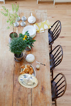
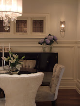
Below is a sneak peek of what the dining room looked like the day we used it for the first time with our guests, I literally took the building permit out of the window seconds before these photos were taken. The room was far from finished; there are no light fixtures, no electrical cover plates, no vent covers and barely any furniture. The table and chairs we moved into the room are completely temporary but work for now - it will ALL be replaced in the near future. The fact that the room isn't complete and is a long way from where I want it to be, would never stop me from making use of it now as best I can.


This is how the table looked while I was half way thru setting it for our first dinner. I filled the bottoms of the hurricane lanterns with sand from the beach and added wild daisies and ferns that I picked from the side of our road (there's no flower shop to run to). In case you're wondering what was on the menu for this inaugural dinner - we had a lobster feed of course. : )
So that's a sneak peek of the new construction in the dining room, the furnishings and artwork are another story all together. Stay tuned for sneak peeks of the other "new" rooms which I'll be posting soon. You can also check out some before photos of the exterior on my first post about the property here and one other post on some of the demo progress here.
Room Design and all Photos by: Carol Reed